Thematic Map Design
31 Mar 2013 - by @黄野1. About thematic maps
1.1 Visual variables of thematic maps
According to Bertin’s theory, the visual variable is commonly used to describe the various perceived differences in map symbols that are used to represent geographic phenomena. As we know, it is the difference in size which map readers perceive as a difference in numbers. All the differences imaginable between symbols can be summarized as being cases of six graphical variables. Bertin discerns, as basic graphic variables: differences in size, differences in lightness or value, difference in grain or texture, difference in colour hue, difference in orientation, difference in shape. With difference in grain or texture, Bertin referred to differences that emerge when a specific pattern is being enlarged or reduced. Differences in colour hue only work in providing qualitative defferences when they are perceived as having similar lightness. Differences in orientation refer to patterns and not to the line elements that form the base map. Therefore, we can summarize it as follow:
- Differences in symbol size, such as line width or in areal symbol.
- Differences in color value of the symbols.
- Difference in color hue of the symbols.
- Difference in colour saturation of the symbols: the percentage of the reflection of light from an object composed of color of a specific wavelength. The larger the reflection percentage of the light with this wavelength, the more saturated or brighter the specific color will appear.
- Differences in symbol grain or texture: Differences that emerge when specific pattern is being enlarged or reduced. The higher the ratio between black and white it will be perceived in the resulting hierarchy.
- Difference in orientation of the symbols.
- Difference in symbol shape: it could be difference in the dots, in the lines, or in the pattern used for area symbols.
- Difference in arrangement: the regularity or non-regularity of the distribution of symbols.
- Difference in focus: the clarity with which the symbols are visible, and so to their definition on the plane.
1.2 Categories of the metadata for thematic maps
- Unipolar data: it has no natural dividing points and do not involve two complementary phenomena.
- Bipolar data: it’s characterized by either natural or meaningful dividing points. A natural dividing point is inherent to the data and can be used intuitively to divide the data into two parts. A meaningful dividing point does not occur inherently in the data, but can logically divide the data into two parts.
- Balanced data: it’s characterized by two phenomena that coexist in a complementary fashion.
1.3 Categories of thematic maps
Chorochromatic Maps: The term of chorochromatic is a combination of the Greek words for ‘area’ (choros) and ‘colour’ (chroma). So originally this method rendered nominal values for areas through different colors. Both pattern(differences in shape) and differences in colors will give the map reader the impression of nominal, qualitative differences. Because we use different colors or patterns to represent the nominal values for areas, some principles need to be followed. Firstly, only different nominal qualities are being rendered, and that no suggestion of differences in hierarchy or order is being conveyed. Secondly, colours present extra problems because they have associative and psychological values. Therefore, we need to choose appropriate colors to render corresponding areas. It means that saturated colors should only be used for small areas, otherwise they would dominate the image too much and lead to the result that hard to discern small areas. Thirdly, if we use different patterns instead of different colours, we need to select the patterns carefully so that the patterns are comparable in dimension. Finally, when chorochromatic maps are being used for the we need to add a diagram showing the actual numbers involved. representation of non-area-related phenomena, the image presented to the map reader might be influenced too much by the actual sizes of the areas. It means that this kind of maps may mislead the readers’ perception of the relationship between the area and quantity. Therefore, we need to add a diagram showing the actual numbers involved.
Choropleth Maps: The term of choropleth is also made up from two Greek words, choros for ’area’ and plethos for ‘value’. So it is values that are being rendered for areas in this method. The values are calculated for the areas and expressed as a stepped surface, showing a series of discrete values. Because differences in grey value are used, a hierarchy or order between the classes distinguished can be perceived as well. The choropleth map is commonly used to portray data collected for enumeration units, such as counties or states. To construct a choropleth map, data for enumeration units are typically grouped into classes and a gray tone or color is assigned to each class. The choropleth map is clearly appropriate when values of a phenomenon change abruptly at enumeration unit boundaries. An important consideration in constructing choropleth maps is the need for data standardization, in which raw totals are adjusted for differing sizes of enumeration units.
Dasymmetric Maps: The dasymetric map is a method of thematic mapping, which uses areal symbols to spatially classify volumetric data. The method was developed and named by Benjamin (Veniamin) Petrovich Semenov-Tyan-Shansky and popularised by J.K. Wright.Cartographers use dasymetric mapping for population density over other methods because of its ability to realistically place data over geography. Considered a hybrid or compromise between isopleth and choropleth maps, a dasymetric map utilizes standardized data, but places areal symbols by taking into consideration actual changing densities within the boundaries of the map. To do this, ancillary information is acquired, which means the cartographer steps statistical data according to extra information collected within the boundary. If appropriately approached it is far superior to choropleth maps in relaying statistical data within areas of interest. Dasymetric mapping corrects for error, termed “ecological fallacy”, that may occur with choropleth mapping. Like other forms of thematic mapping, the dasymetric method was created and historically used because of the need for accurate visualization methods of population data. Dasymetric maps are not widely used because of the limited options for producing them with automated tools such as Geographic Information Systems. Although fields such as public health still rely on choropleth maps, dasymetric maps are becoming more prevalent in developing fields, such as conservation and sustainable development. Researchers in various fields of science are pushing the way for use of so-called critical GIS and to make dasymetric mapping techniques more easily applicable with modern technology.
Dot maps: It is a special case of proportional symbol maps, as they represent point data through symbols that each denotes the same quantity, and that have been located as well as possible in the locations where the phenomenon occurs. To create a dot map, one dot is set equal to a certain amount of a phenomenon, and dots are placed where that phenomenon is most likely to occur. Constructing an accurate dot map requires collecting ancillary information that indicates where the phenomenon of interest is likely found. The dot map is able to represent the underlying phenomenon with much more accuracy than other methods.
Isarithmic maps: It depicts smooth continuous phenomena, such as rainfall, barometric pressure, depth to bedrock, the earth’s topography and so on. After the choropleth map, the isarithmic map is probably the most widely used thematic mapping technique, and is certainly one of the oldest, dating to the 18th century. An isarithmic map is created by interpolating a set of isolines between sample points of known values.
Isopleth map: It is a specialized type of isarithmic map in which the sample points are associated with enumeration units. It is an appropriate alternative to the choropleth map when one can assume that the data collected for enumeration units are part of smooth continuous phenomenon. And the isopleths map requires that standardized data be used to account for the area over which conceptual data are collected.
Cartogram: A cartogram is a map in which some thematic mapping variables – such as travel time or Gross National Product – are substituted for land area or distance. The geometry or space of the map is distorted in order to convey the information of this alternate variable. There are two main types of cartograms: area and distance cartograms. An area cartogram is sometimes referred to as a value-by-area map or an isodemographic map, the latter particularly for a population cartogram, which illustrates the relative sizes of the populations of the countries of the world by scaling the area of each country in proportion to its population; the shape and relative location of each country is retained to as large an extent as possible, but inevitably a large amount of distortion results. Other synonyms in use are anamorphic map,density-equalizing map and Gastner map. A distance cartogram may also be called a central-point cartogram or isochronic cartogram. This form is typically used to show relative travel times and directions from vertices in a network.
2. Thematic Map Design
2.1 Analysis of the metadata
The given data is consist of Europe data and country boundaries. Europe data was collected from Eurostat which contains separate datasets of economy, life expectancy, population and employment. The country boundaries are extracted from a world-wide country dataset of ESRI. In this article, we will mainly focus on the map design for life expectancy which is the most commonly used indicator for analyzing mortality(the gradual increase in life expectancy is one of the contributing factors to the ageing of the EU-27’s population). Generally, the life expectancy dataset represents the LE of EU member countries in the year 2007 and the data is categoried by genders(male, female).
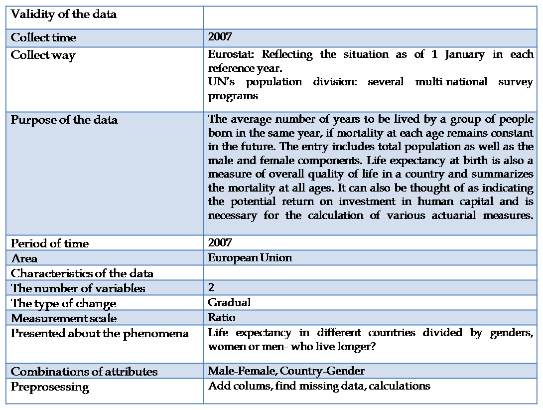
Figure 1 Analysing the dataset of Life expectancy
2.2 Map design
Firstly, this map should integrate different statistic information in the form of graph, table and map so that people are able to perceive or receive detailed information in a more richful and intuitive way. Secondly, according to the dataset, interpretation of statistics represented with maps can be made by proportional symbols (2 circle symbols with the same center and different colors to represent male and female life expectancy in one country). Bigger circles stand for more longevous and we can therefore easily explore gaps of LE in different countries and differences of male and female LE in one country. However, we still have some limitations by using proportional symbols map: it is hard to compare the symbols on the map with the legend and users cannot distinguish the precise value of life expectancy. Therefore, adding data table to help readers enhance the capability of comprehending seems to be a wise decision.
There are a variety of templates for arranging layouts in ArcGIS, so we choose one of them called Landscape Modern Inset to organize the map(main data frame, central part of the template), table(secondary data frame, bottom right corner), graph(upper-right corner) and title(blue mask with white words, top part of the template). As the background color of the template applies the Turquoise tone, I need choose the harmonious colors of the map and the legend graph. As the result, I find a sequence of color based on a color scheme called the square color scheme which uses four colors arranged into two complementary pairs and all four colors space evenly around the color circle: yellow, light green, light cyan , blue and peach.As this scheme works best if we let one color be dominant.Thus, here the dominant color is the blue-green.And other two complementary colors represent the life expectancy circles so that they can pop-up. Finally, all of the elements (proportional symbols map, table, legend graph, north arrow, coordinate system, scale bar, title and description) will be aesthetically arranged.
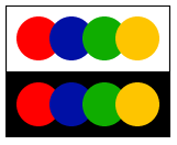
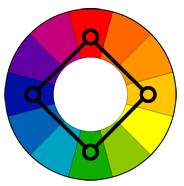
Figure 2 The square color scheme
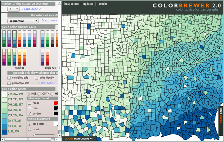
Figure 3 Using the COLORBREWER Tool to define the color value of each classified patch based on the thoery of harmonious colors
Because we don’t have the life expectancy data of some European countries, we need to make the subset countries based on the Europe_countries metadata and join the life expectancy data into the attributes table, then highlight those regions. To make the .dbf file which will be joined to the attributes table later, we need to modify the Excel file(add columns of codes and names of countries to the life expectancy Excel file by using the relative formula, and the codes will be the field in the layer that the join will be based on) and export the data as .dbf data format. After joining the life expectancy data into the attributes table, we need to delete some Europe countries which has no life expectancy data by using the tool of “Select by Attributes”. Finally, we classify the male and female life expectancy data by 5 classes with the Equal interval method. Because intervals of the male and female life expectancy are different, we need to calculate the growth rate of these 2 datasets (male and female), and assign the proper symbol size to them.
The main processes can be summarized as following steps:
- Verifying the .dbf tables
- Making a join
- Verifying the join worked
- Making a Feature Layer
- Making a shapefile with the joined tables combined
- Projections
- Exporting projected shapefile
- Making Graduated symbol map
- Reclassifying the datasets
- Arranging the map layout
2.3 The final work

Figure 4 Life Expectancy of European Countries in 2007